Avatars are very flexible graphical symbols that can be used in many situations
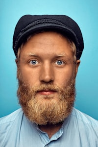
Avatars are used in many components to provide the user a supported connection to content being reviewed. They provide a tangible icon representation of a entity. Or a personal headline of a contact.
Depending on what information is available from the target, the use of initial(s) provide a good way of supportive identification and emphasis. Images and logos can also be implemented within our avatars.
Beeline utilizes a preset selection of paired colors that work with our existing color palette.
For consistency, avatar sizes are limited to 3 sizes (32px, 48px, and 64px). Having these components fixed will keep all of our components uniform across every product. In mobile applications, we suggest using a 32px sized avatar.
Avatars serve as a visual, supportive representation of an entity. We can make these elements more inclusive by providing alt tags describing the purpose or representation. Because these are merely supportive elements, parameters such as contrast ratio, are not a requirement. However, our products can be more accessible with our use of additional, aria-related markup.