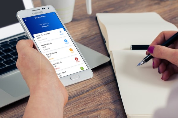
Imagery should be authentic, stay away from stock photography that appears overly staged. It is equally important that the imagery you choose is relevant to the subject it is supporting.
Try to avoid overly staged or photoshopped photos
Instead, try to find imagery that places people and objects in their natural setting. If the content you are supporting requires people, try to use Beeline employees when possible. If the content showcases technology, then show the technology. Try not to rely on heavy graphics to support the message because this can often distract from the message itself.
Imagery should be high quality. For graphics use vectors when possible. For images, they should not be blurry or pixelated, and do not distort an image to force it into a size it is not designed for.
Images of poor quality affect the perceived quality of our products. So, when using images make sure they are high enough resolution for the space they are being used


Do not distort imagery for any reason


We often place content over images. When this happens, it is important that the messaging is clear and does not get lost in the image for any reason. It is acceptable to place a darker overlay over an image or a blue gradient overlay to help content remain clear and readable.
Make sure your content doesn't get washed out by background noise
We choose not to rely on heavy illustrations to support our content, so if you think you have a situation that requires illustration please reach out to our product design team through the support section. We do often leverage abstract imagery to re-enforce brand colors. Our iconography is simple and provided by the Icon library Font Awesome
To keep our designs accessible, we provide alt tags in our image elements. This ensures the visual message that we are trying to convey isn't lost upon those who may rely on the help of screen readers. Read more about it at the Web Accessibility Initiative.