Modal Styles and Usage
Modals are used to inform users about a task, event or request. They acquire the user's attention by presenting a dialog in front of the content being viewed at the time of execution, interrupting the user with a combination of a lightbox and call to action. Modals allow us to engage the user's primary focus without taking them to a new screen. Keep in mind that modals are purposefully interruptive, so if by using a modal you are hindering the user's ability to make an informed decision, an Action Panel might be a better solution.
| Modal Background Color | Modal Box Shadow | Modal Border Radius | Modal Border Style | Overlay Color |
|---|---|---|---|---|
Modal Background ColorWhite (#ffffff) |
Modal Box Shadow0 0px 20px 0 rgba(0, 0, 0, 0.2) |
Modal Border Radius6px |
Modal Border Stylenone |
Overlay Colorrgba(0,0,0,.5) |
Modals when used correctly can enhance a user experience. Below you will find examples of our different types of modals and how they should be structured.
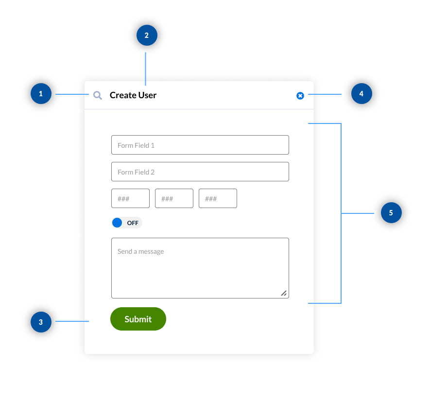
For small forms, 1-5 fields long, using a modal can be a better option than taking the user to a new page. For longer forms use an Action Panel
Supportive Icon:
Select an icon that is relevant to the title
Title:
Title's should be short and descriptive
Call to Action:
Call to actions in form modals are always left aligned, and use the primary color
Close Action:
Close action is always located in the top right of the modal and is optional
Form Elements:
Form elements make up the body of the modal and should not exceed 5 elements
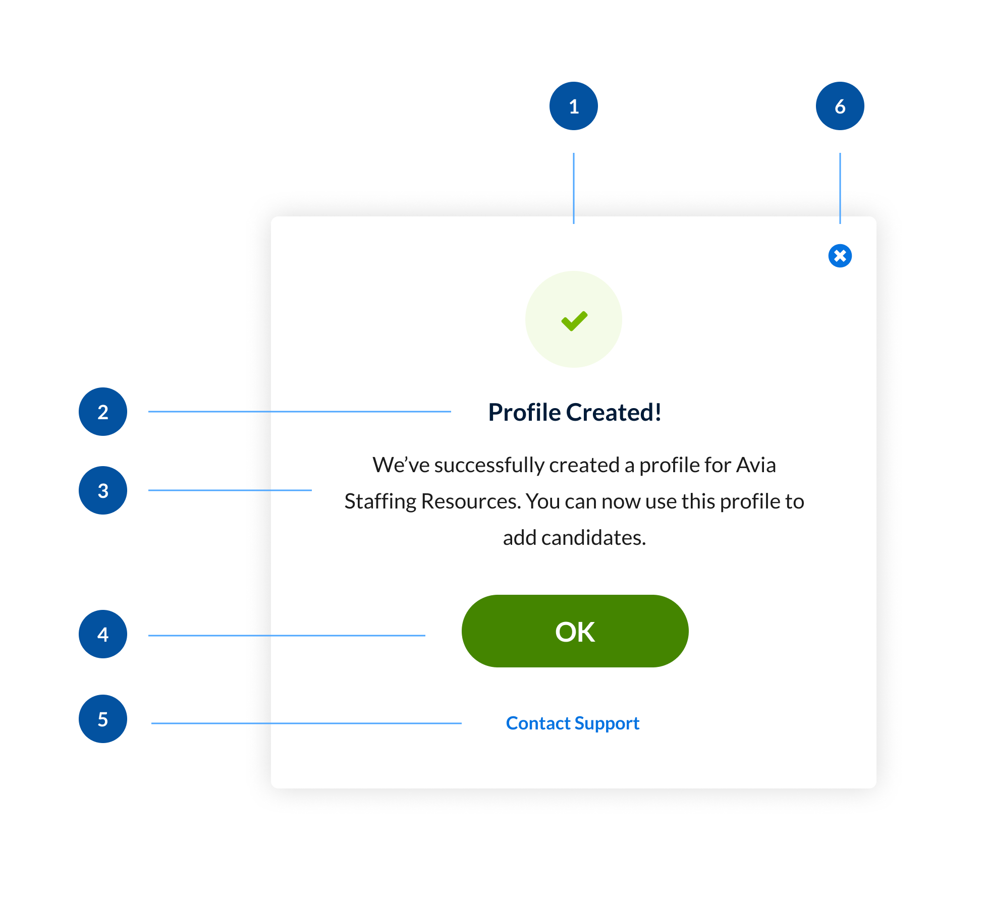
Notification dialogs are great for notifying the user of consequences from actions. They can be used in similar situations as notifications. The main difference is they are more disruptive than a notification because they don't allow the user to proceed without confirming they've read the message.
Supportive Avatar:
Select an icon that is relevant to the title. The avatar should be center aligned
Title:
Title's should be short and descriptive and centered within the modal
Message:
Message should follow our Voice & Tone Guidelines and be center aligned
Primary Call to Action:
Call to actions on notification modals are always centered with content.
Secondary Call to Action (Optional):
A secondary call to action is optional
Close Action:
Close action is always located in the top right of the modal and is optional
Informational
Informational notifications are used to give the user additional information that isn't a result of an event.
| Avatar | Icon |
|---|---|
Avatar |
Icon |
Success
Success notifications are used to inform the user of a successful action, this action could be user generated or system generated.
| Avatar | Icon |
|---|---|
Avatar
Green 2
|
Icon |
Danger
Danger notifications are used to inform user of errors or failures.
| Avatar | Icon |
|---|---|
Avatar |
Icon |
Warning
Warning notifications are used when an event or action triggers merits a warning message.
| Avatar | Icon |
|---|---|
Avatar |
Icon |
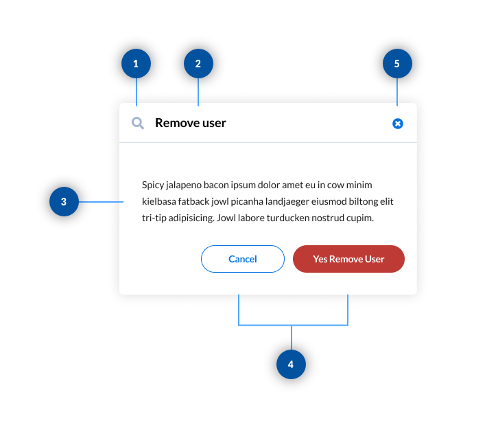
Confirmation dialogs are a great way to require the user to stop and think before continuing with an action that could potentially have a great impact on future decisions. Some examples include deleting a record or proceeding with a walkthrough. Confirmation modals differ from notification modals in that they always give the user a way to back out their decision. This is usually in the form of a cancel button or close button.
Supportive Avatar:
Select an icon that is relevant to the title.
Title:
Title's should be short and descriptive and centered within the modal
Message:
Message should follow our
Voice & Tone Guidelines and be left aligned
Call to Action:
Call to actions should be located in the bottom right of the modal.
There should always be two buttons. The left button is the back out button or cancel button. This button is always our Neutral button
The right button is the final call to action.
The final call to action button should be either our Primary button or our Danger button depending on the message.
Close Action:
Close action is always located in the top right of the modal and is optional
The modal retains focus until dismissed, or an action has been taken. They shouldn’t be obscured by other elements, partially visible on the screen. This is reinforced by using a lightbox effect, setting the backdrop at a 50% opacity of black. This overlay aids in obscuring the content behind the modal.
Because the modal interrupts the user's view, we use animation to retain some fluidity to the overall experience with the product. When launching a modal, either use a fade in or slide down from the top animation to transition the modal into view.